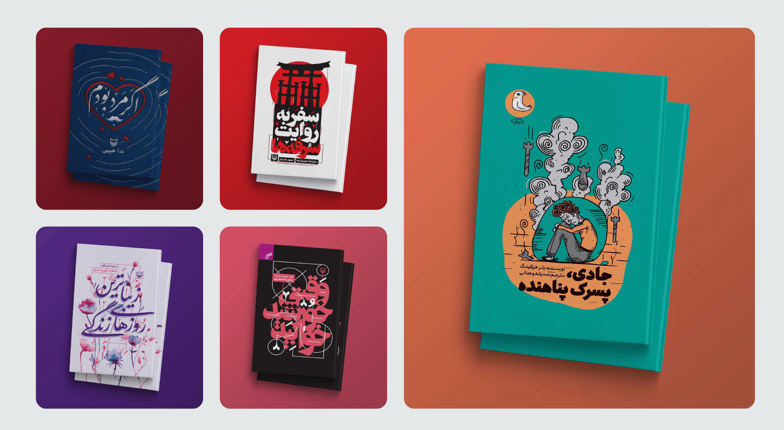
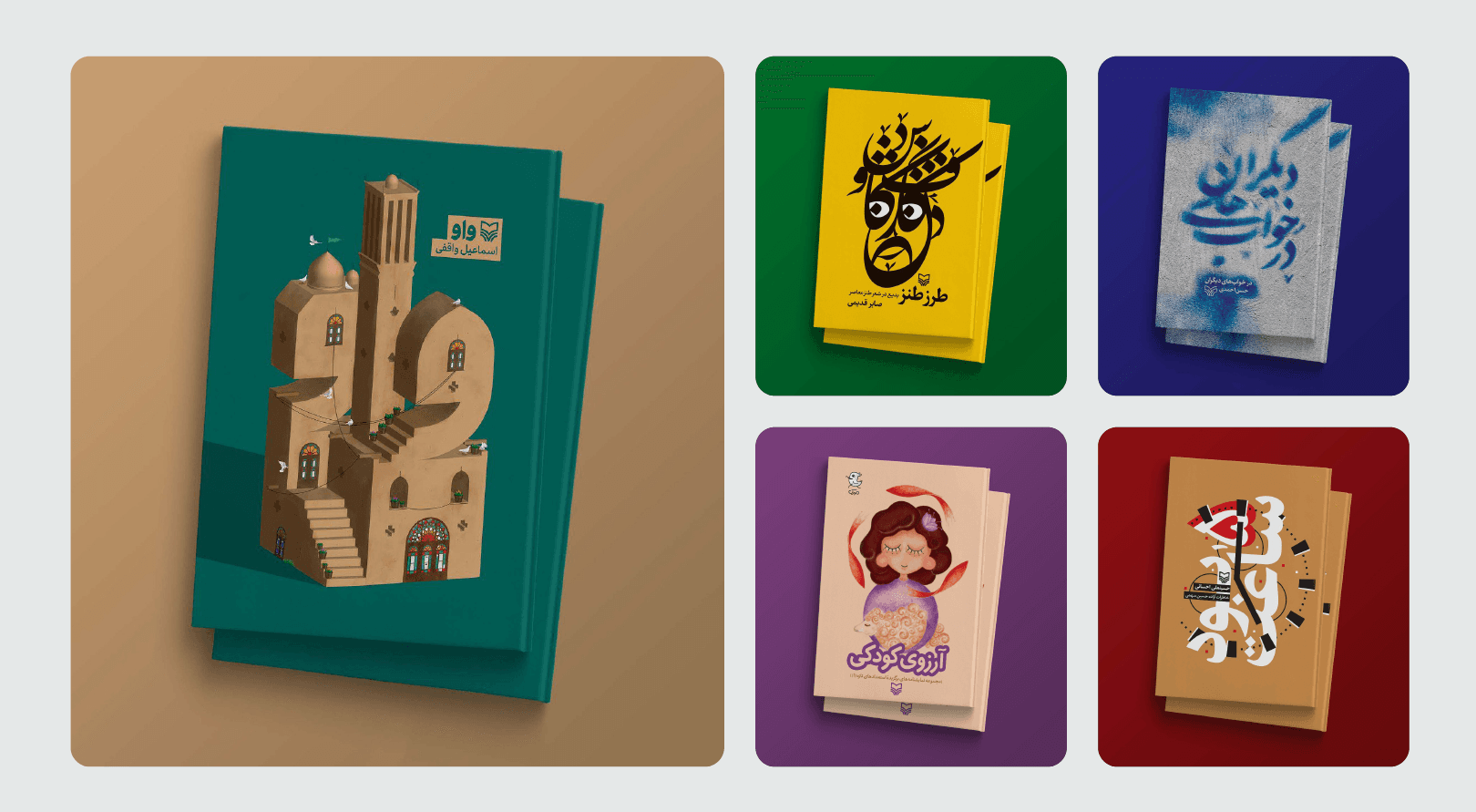
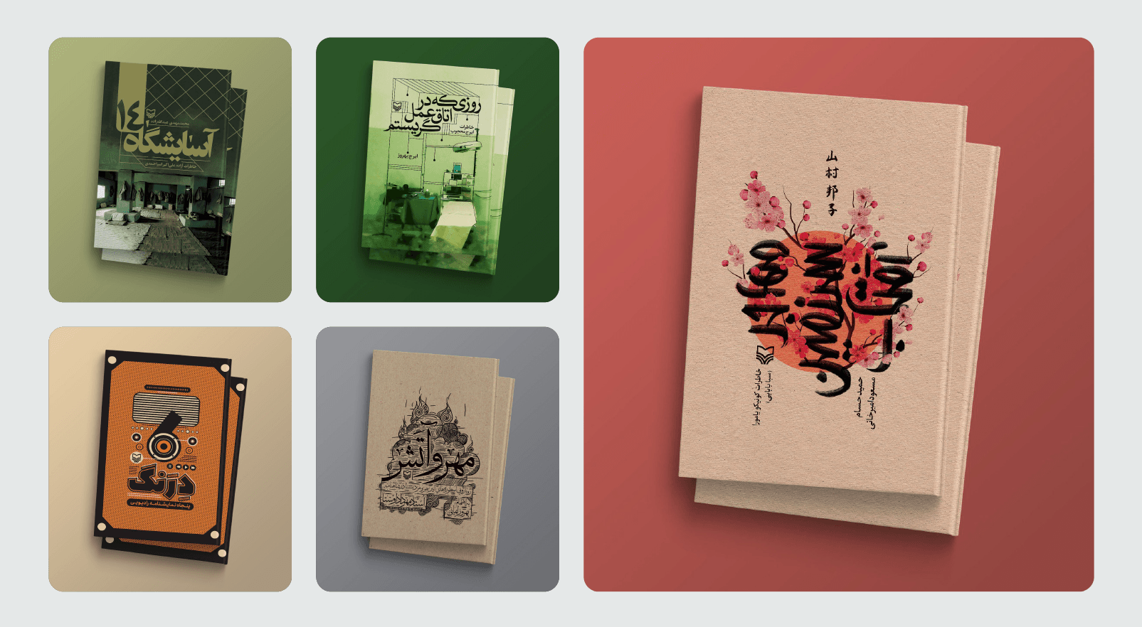
book covers
website & web_app
1. Energy Shift
Everything corporate you showed me before was:
Controlled
Structured
Predictable
These covers are:
Expressive
Typographic
Emotional
Culturally rooted
There is tension.
There is rhythm.
There is personality.
This is where you stop designing “correctly”
and start designing with instinct.
2. Typographic Confidence
Here’s the biggest difference:
In your branding work,
type is functional.
In your book covers,
type is the hero.
You distort it.
Layer it.
Illustrate with it.
Build compositions around it.
That’s bold.
That’s voice.
That’s identity.
3. Color Courage
Finally, you’re not afraid.
Yellow.
Deep red.
Teal.
Purple.
High contrast.
You don’t hide behind neutral palettes here.
This is the confidence I didn’t see in the corporate work.
4. Composition
Some covers are very strong:
• The architectural 3D typography piece
• The bold black-red poster-style composition
• The illustrated girl cover
• The expressive calligraphic floral piece
These show visual instinct.
You understand hierarchy when you allow yourself to.
5. Weakness Here
Not everything is strong.
Some covers feel overworked.
Some typography becomes dense.
A few feel like poster design rather than refined publishing design.
But that’s okay —
because at least they have personality.
Big Realization
You are two different designers.
Corporate You:
Safe.
Systematic.
Approval-focused.
Editorial You:
Bold.
Cultural.
Expressive.
Confident.
Your problem is not skill.
Your problem is identity integration.