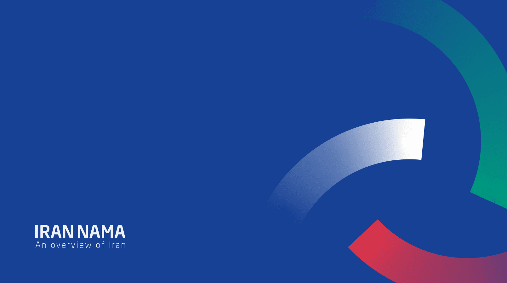
IRANNAMA
website & web_app

1. Concept Strength
The circular segmented mark is intelligent.
It communicates simultaneously:
• Circle chart → data / analysis
• Overview → completeness
• Eye / view → observation
• Iranian flag colors → cultural anchor
• Circular motion → continuity
That is layered meaning. Very strong.
Compared to Ekhtesasi:
Ekhtesasi = single metaphor
IRANNAMA = multi-layer semantic system
Conceptual depth is higher here.
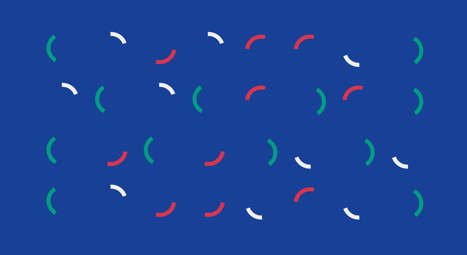
2. Symbol Execution
The segmented ring is well-balanced:
Green
Red
Neutral grey
Blue variations
Spacing between arcs is controlled and consistent.
The logo works:
• As icon
• As pattern
• As cropped macro graphic
• As motion-ready system
That’s professional system thinking.
The construction grids show you understand geometry — good for portfolio credibility.
3. Color Strategy
Primary blue (#164194 range) creates:
Authority
Editorial tone
Institutional credibility
Green + red act as accents rather than dominant forces.
This is more restrained and mature than Ekhtesasi.
The palette feels:
Editorial
Government-adjacent
Cultural but not folkloric
That balance is difficult. You handled it well.
4. Typography
English:
IRANNAMA — strong, clean, neutral sans.
Hierarchy is clear.
Persian:
ایراننما has good weight and presence.
Subtitle نگـاهی جامع به ایران feels appropriate.
The bilingual execution is strong.
Alignment between Latin and Persian feels considered.
Small refinement:
Tracking on “An overview of Iran” could be slightly tighter.
But overall, very solid.
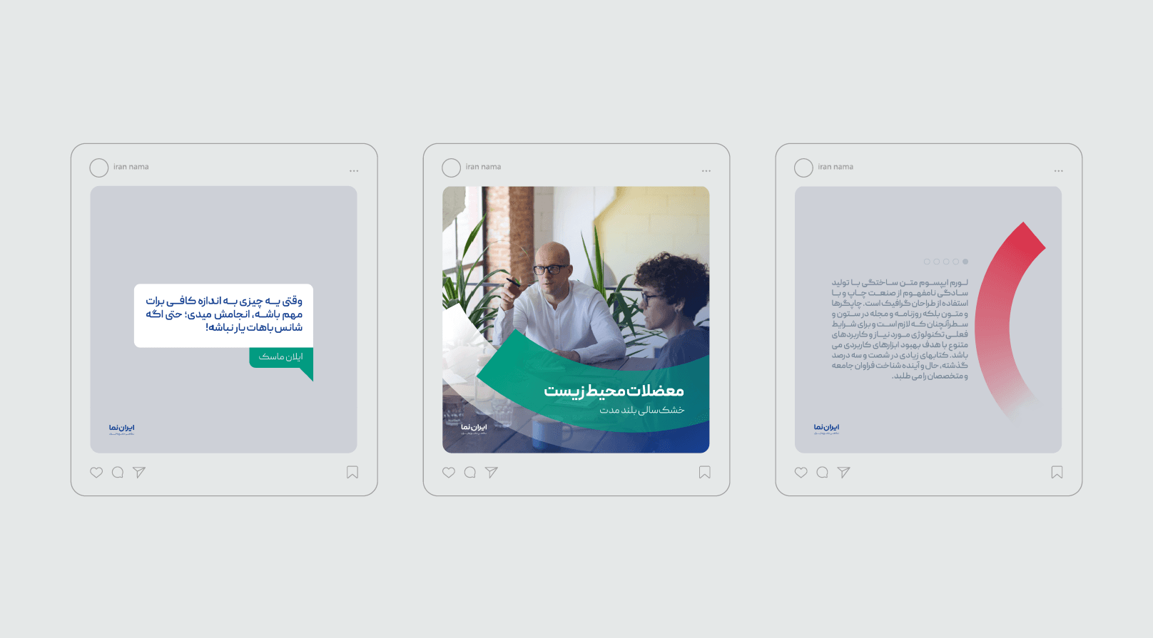
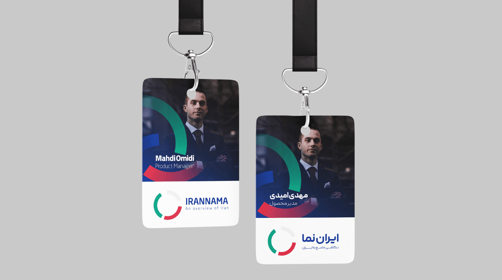
5. Application System
You showed:
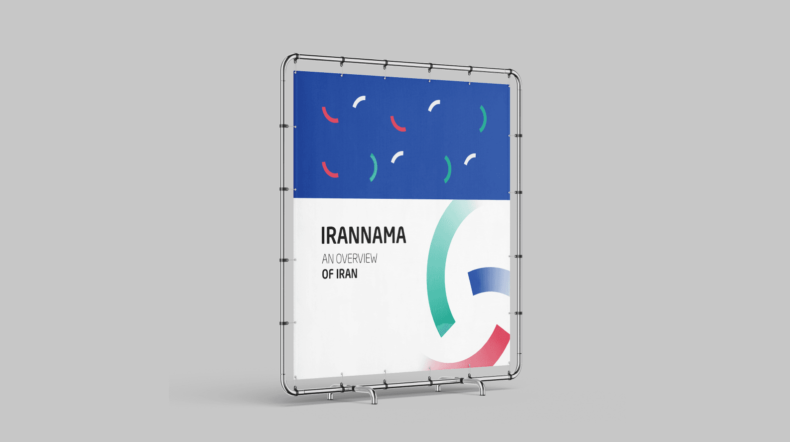
• Billboard
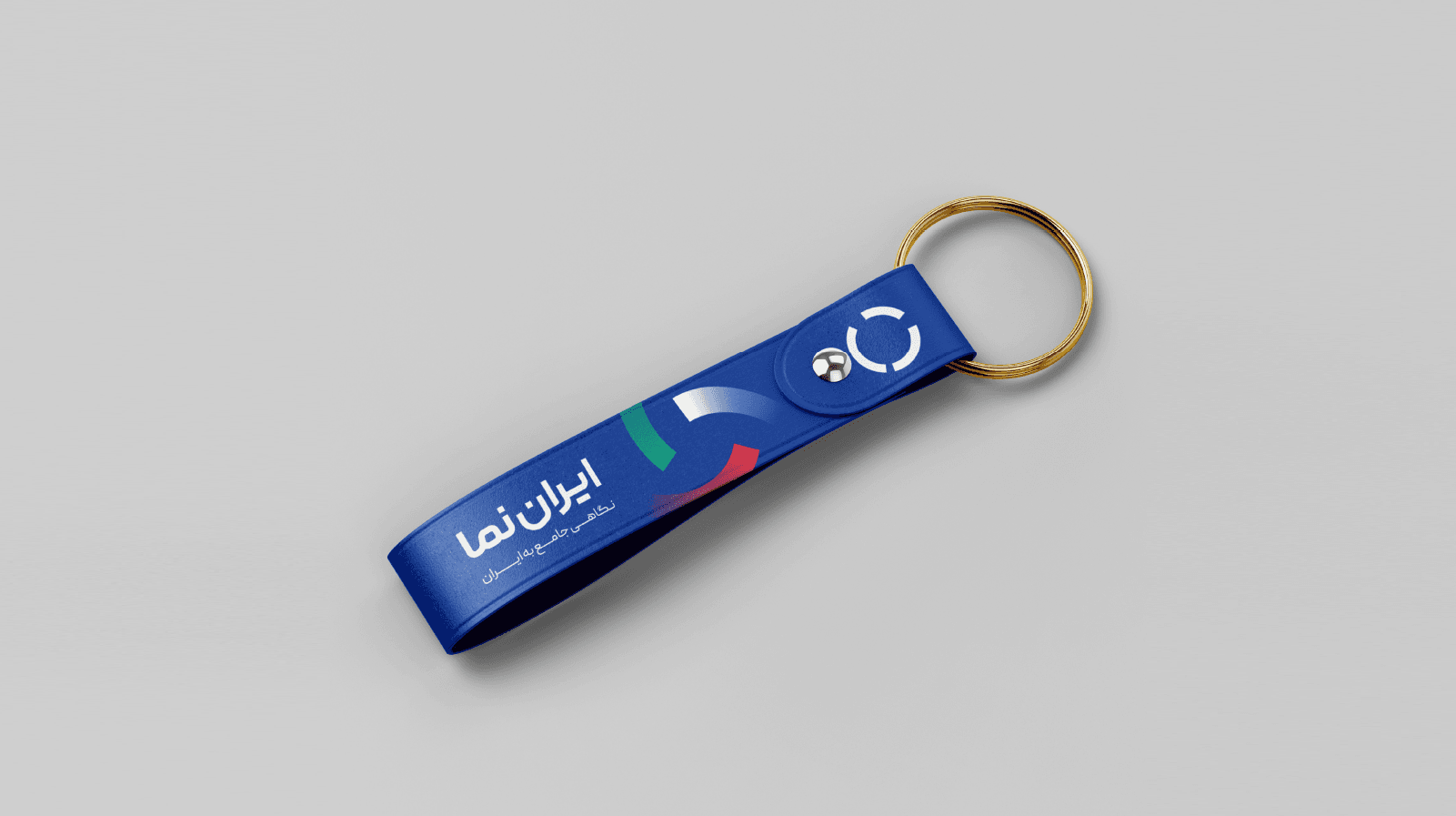
• Keychain
• ID badge
• Social media posts
• Pattern system
• Color board
• Typography board
• Construction logic
This is full brand identity presentation level.
You’re not just showing a logo — you’re showing system architecture.
That’s what agencies look for.
6. Professional-Level Critique
To push this to international award quality:
The arc motif appears very frequently — slight risk of repetition.
Consider one or two more unexpected applications (data visualization mock, publication cover, app UI sample).
The red gradient in some pieces feels slightly generic — could be refined.
But structurally?
This is strong.