Vitrin Studio | Complete Brand Identity & Guidelines System
website & web_app

Overview
Vitrin Studio’s brand is more than a logo. It is a structured visual system designed to communicate clarity, growth, and memorability across all touchpoints.
The mission of Vitrin Studio is to help businesses and individuals grow their social visuals and audience.
The vision is a world where online advertising is simple, accessible, and results-driven for everyone.
This brand guideline ensures consistency, scalability, and strategic visual communication.
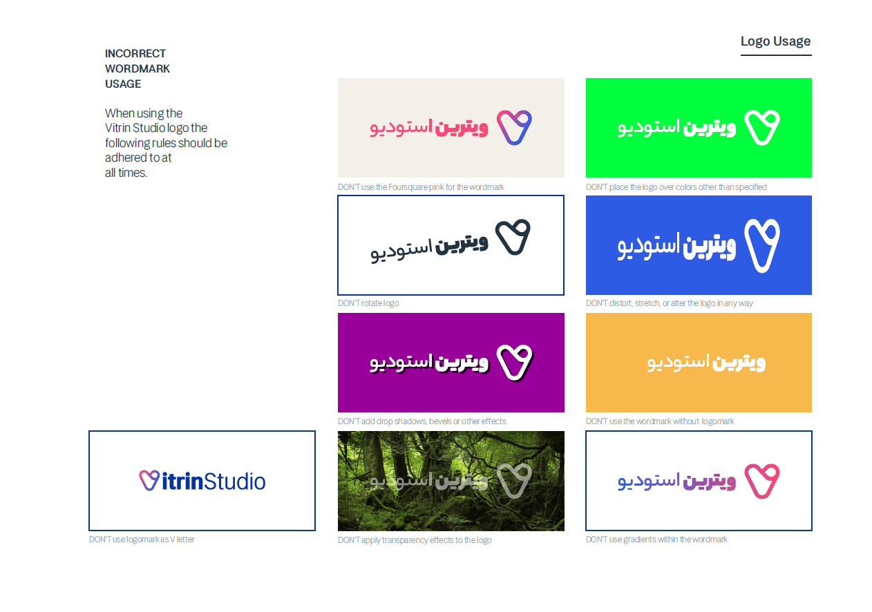
Logo System
The identity includes both Farsi and English wordmarks alongside a distinctive gradient logomark.
Clearspace & Sizing
The logo must always maintain protective clearspace equal to the height of the “V” element.
Minimum digital sizes:
100px width
20px width
The logo must never be distorted, rotated, stretched, recolored improperly, or used without its mark.
Color System
Core Colors
Navy Blue (Base Color – dominant 60%)
Supporting Blue tones
Accent Pink (Watermelon #F94877)
Structured grayscale system
Gradients are restricted to logo mark usage only and must not be used as background.
Secondary Palette
Used for campaigns, short-term events, and social content refreshes.
Designed to add flexibility without breaking brand consistency.
Typography System
Primary Farsi Font
Yekan Bakh
Used for headlines (Fat & Heavy) and supporting copy (Bold to Hairline).
Secondary Farsi Font
Sahel
Used for body text and long-form content.
English Brand Font
LT Amber
Used consistently across titles, supporting text, and extended copy.
Typography hierarchy ensures readability, warmth, and modern clarity.
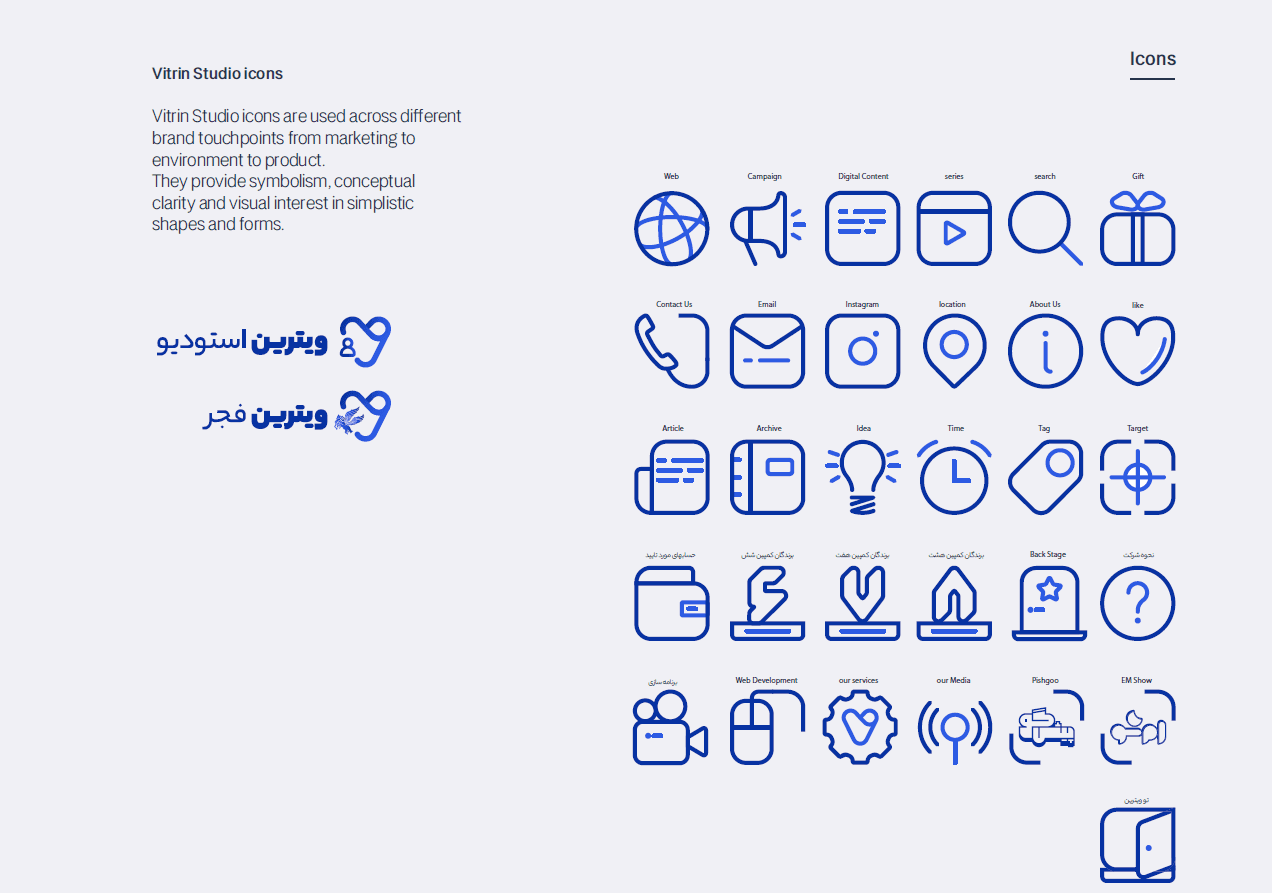
Icon System
Vitrin Studio uses a custom icon library applied across marketing, product, campaigns, and digital platforms.
Icons are minimal, line-based, and consistent in stroke weight to maintain conceptual clarity and visual harmony.
Graphic Elements & Pattern
The brand includes a structured pattern system derived from the logo form.
Graphic tools include:
Repeating logomark patterns
Layered geometric elements
Color blocks
Visual rhythm grids
These elements ensure recognizability across social and digital platforms.
Instagram System
The brand defines strict positioning rules for posts and stories:
Only main logo on white background
Logo placement must follow predefined grid positions
Text and key elements must remain inside inner safe zone
1080x1080 and 1080x1920 formats specified
Color sequencing must follow defined brand rhythm to maintain visual consistency in feed layout.
📄 PDF Attachment Description
Vitrin Studio – Brand Guidelines 2021
This document outlines the complete visual identity system of Vitrin Studio, including logo usage rules, color strategy, typography hierarchy, icon system, graphic elements, and Instagram layout standards. It serves as a comprehensive guide to maintaining consistency across all brand touchpoints.