akhtesasi Lifestyle / Goal-Oriented / Personal Growth Identity
website & web_app
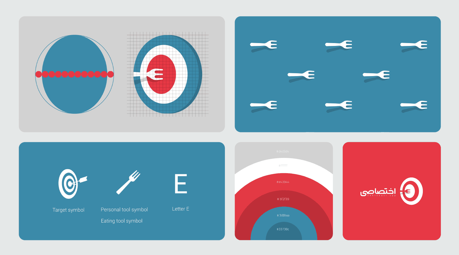
1. Strategic Core
The brand merges three elements:
Target → Goal
Fork → Eating / Lifestyle
Letter “E” → Brand initial
The fork penetrating the target is conceptually sharp.
It communicates:
Personal focus
Measurable goals
Lifestyle optimization
Precision
This is clearer conceptually than Techinvest.
2. Symbol Construction
The circular target system is well structured.
The fork aligns horizontally through the bullseye — visually communicating:
Control
Intentional action
Goal achievement
The geometry feels intentional, not decorative.
The grid presentation reinforces professional execution.
This is good portfolio material.
3. Color Strategy
Palette:
Red → Energy / Urgency / Action
Muted blue → Stability / Trust
White → Clarity
This red is bold and lifestyle-oriented — closer to fitness branding.
Compared to your other projects:
LIAM → Corporate navy
Techinvest → Electric blue tech
Ekhtesasi → Energetic consumer-facing
Good range across your portfolio.
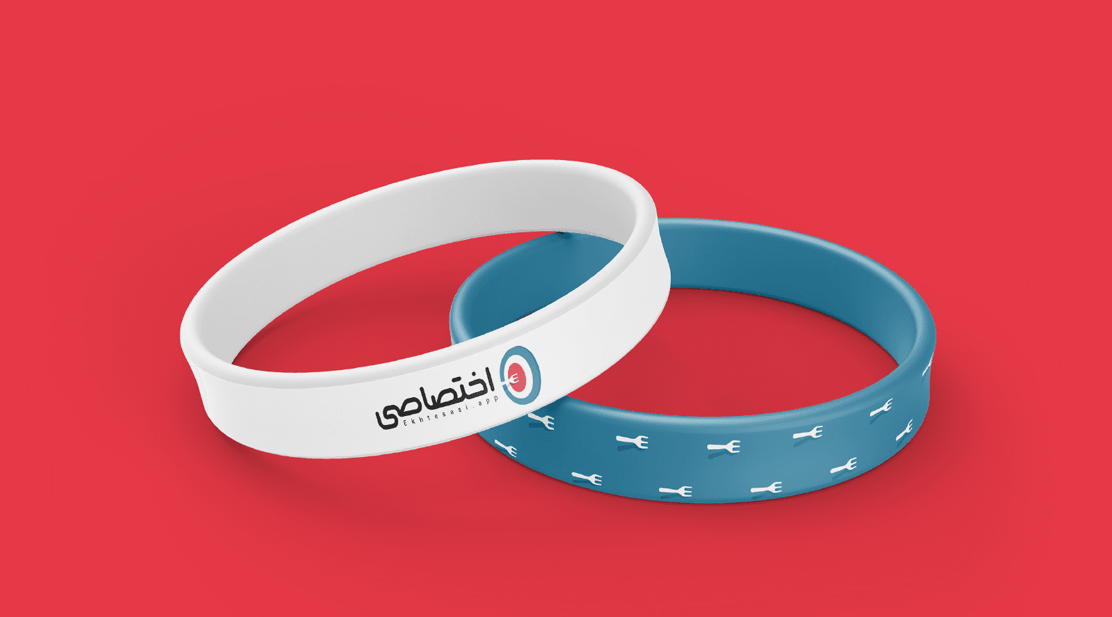
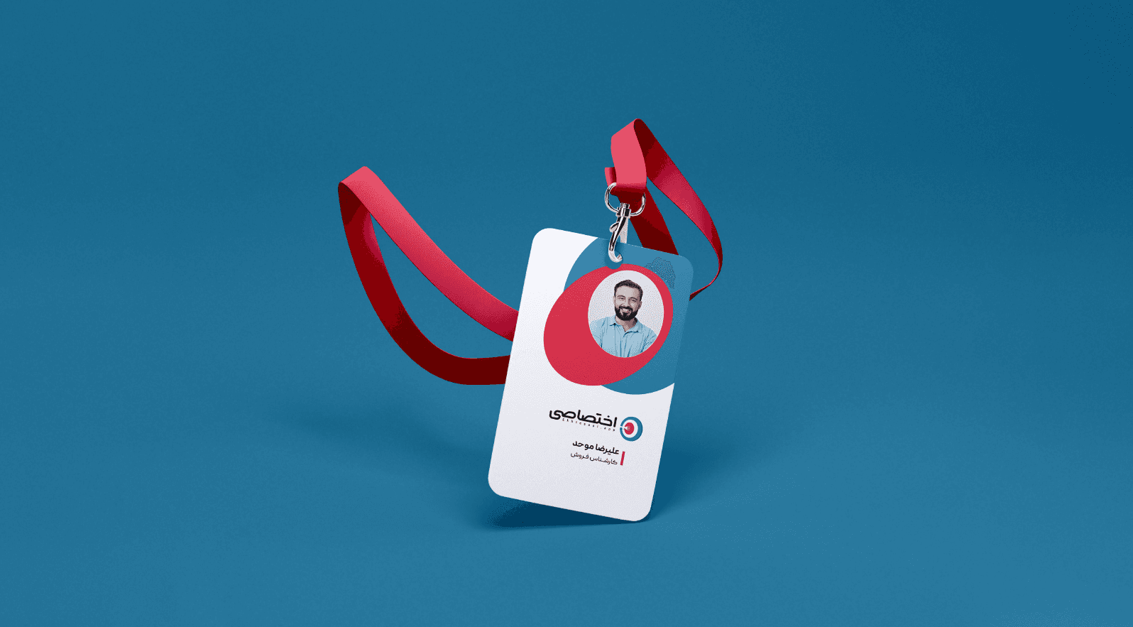
4. Visual System
You extended the identity into:
ID card
Wristbands
Pattern system
Badge mockups
Social visuals
The fork pattern is strong — minimal, recognizable, scalable.
The concentric color layers give depth without overcomplication.
5. Typography
The Persian wordmark is clean and confident.
The Latin subtitle “Ekhtesasi.app” is understated.
One small improvement: spacing between Latin letters could be slightly refined for more polish.
But overall: solid.
6. Strengths
✔ Conceptually strong
✔ Clear metaphor
✔ Good symbolic integration
✔ Strong system logic
✔ Cultural localization (Persian identity)
✔ Clean mockup execution
Concept strength here is higher than Techinvest.
7. Weaknesses (Professional-Level Critique)
The fork illustration style is slightly generic — could be more distinctive.
The red is powerful but very dominant — more tonal variation could elevate it.
Some compositions rely heavily on large red blocks — slightly predictable layout system.
Still strong — but refinement could push it to international award level.