Brand Identity & Campaign System Fitness / Lifestyle / Digital Health
website & web_app
Overview
VActive is a digital fitness and lifestyle brand built around one powerful idea:
Personal progress over competition.
Instead of competing with others, the brand encourages individuals to surpass their previous version.
Core message:
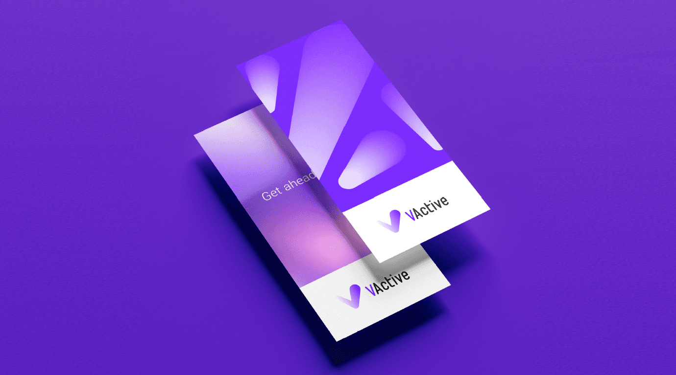
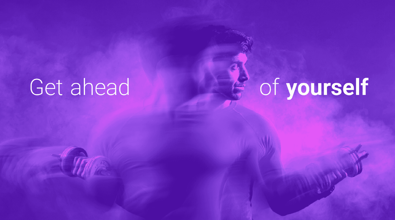
Get ahead of yourself.
The identity system communicates movement, achievement, and self-ownership in a modern and energetic visual language.
Brand Strategy
VActive positions itself as:
A personalized fitness experience
A digital-first training platform
A performance-driven lifestyle brand
The emotional promise is simple:
You are your only competition.
The brand motivates continuous improvement through clarity, discipline, and momentum.
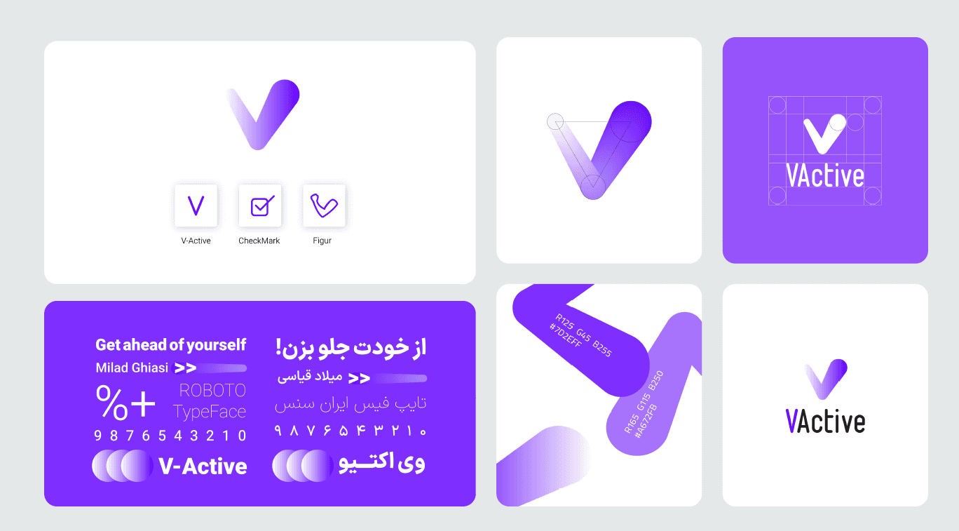
Logo Concept
The VActive logo is built from three integrated meanings:
V — representing “VActive”
Checkmark (✔) — symbolizing achievement and completion
Forward motion — expressed through the angle and geometry
The mark communicates:
Progress
Validation
Action
It is minimal, geometric, and scalable across digital and physical applications.
Visual Identity
Primary Color System
A dynamic purple gradient system defines the brand’s visual energy:
#7A2EEB
#A457EB
#D12EFF
Purple was selected to represent:
Energy
Technology
Transformation
Future-forward movement
Soft gradients and motion blur effects reinforce the feeling of speed and forward progress.
Typography
Primary typeface: Roboto
Selected for:
Modern digital tone
High readability
Strong presence in UI environments
Typography hierarchy emphasizes key words such as:
Own
Your
Healthy
This strengthens emotional engagement and visual rhythm.
Motion Language
The campaign visuals incorporate:
Motion blur
Layered duplication
Light distortion
Directional gradient flow
These elements create a consistent visual metaphor:
Outrunning your former self.
The motion system becomes part of the brand DNA rather than just a stylistic choice.
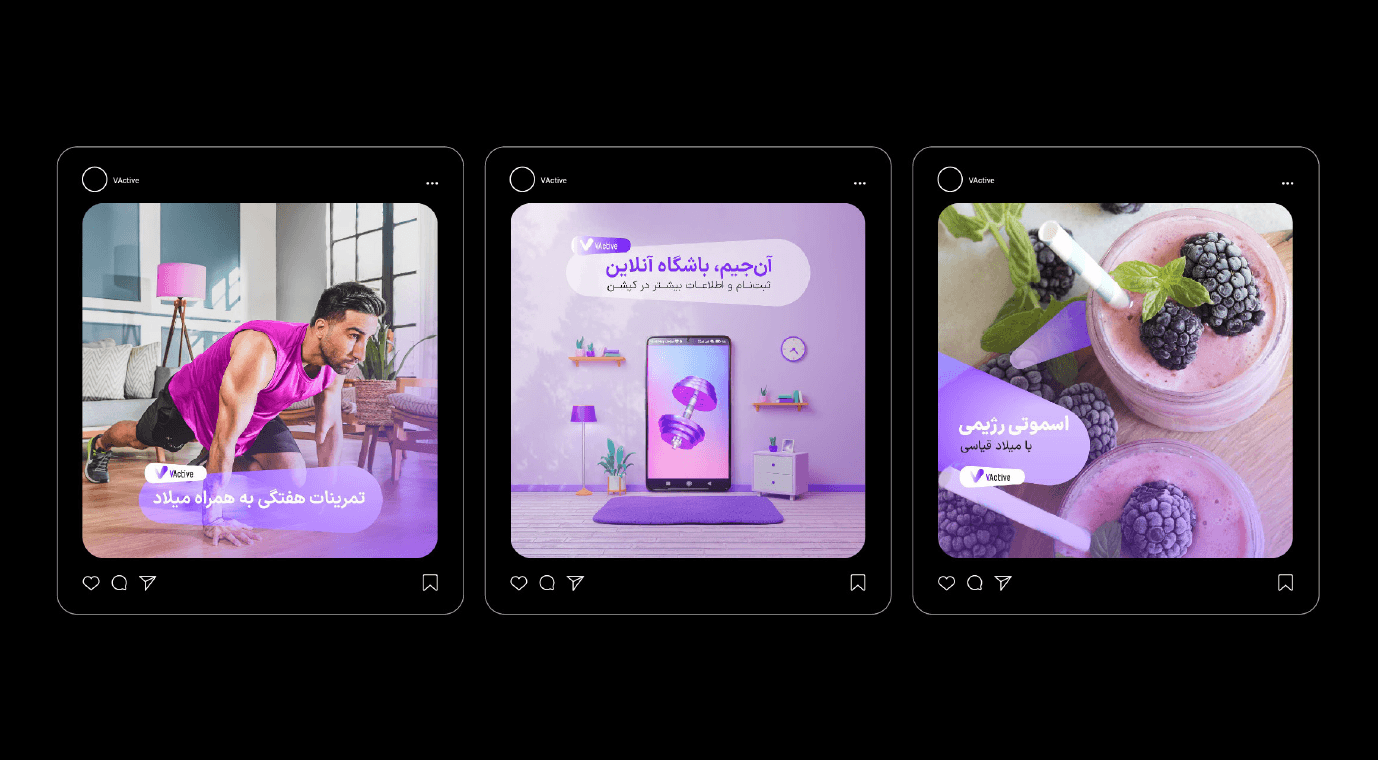
Social Media System
The Instagram layout features:
Clean black framing
Standardized card format
Bold headline placement
Strong gradient overlays
Focused messaging
Content categories include:
Weekly training
Online coaching
Nutrition (e.g., smoothie plans)
App-based fitness
All posts maintain a unified visual structure.
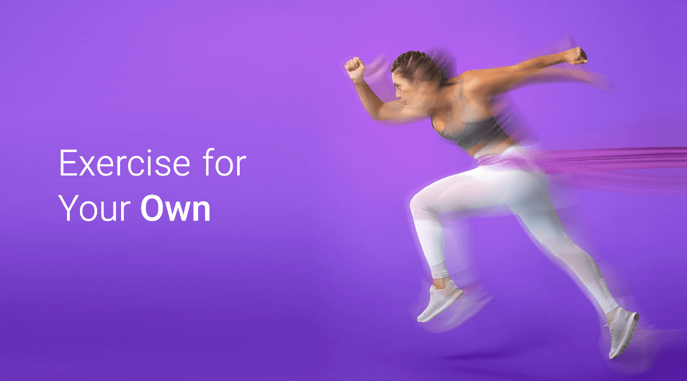
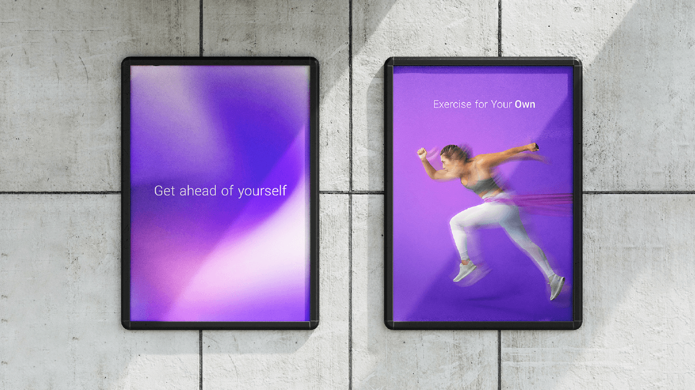
Outdoor Campaign (OOH)
Billboard executions focus on:
Minimal typography
High-impact athlete imagery
Strong negative space
Dramatic purple atmosphere
Examples include:
Exercise for Your Healthy
Exercise for Your Own
The message remains short, motivational, and direct.
Brand Applications
The system extends across:
Print materials
Story templates
Brochures
Logo construction grid
Color guideline sheets
Iconography system
VActive is not just a logo — it is a complete brand ecosystem.
Psychological Positioning
The brand speaks to internal competition.
Instead of comparison culture, it promotes:
Self-discipline
Personal accountability
Continuous growth
This positioning differentiates it in the saturated fitness market.
Strengths of the Project
Strong and cohesive color system
Clean geometric logo construction
Consistent motion language
Digital-ready typography
High adaptability across media
Professional campaign execution