Dr. Shoel
website & web_app

Dr. Shoel — is a completely different category.
This is not expressive.
This is not premium.
This is not conceptual.
This is positioning-driven branding.
And that’s important.
Let’s evaluate it properly.
1. Core Idea
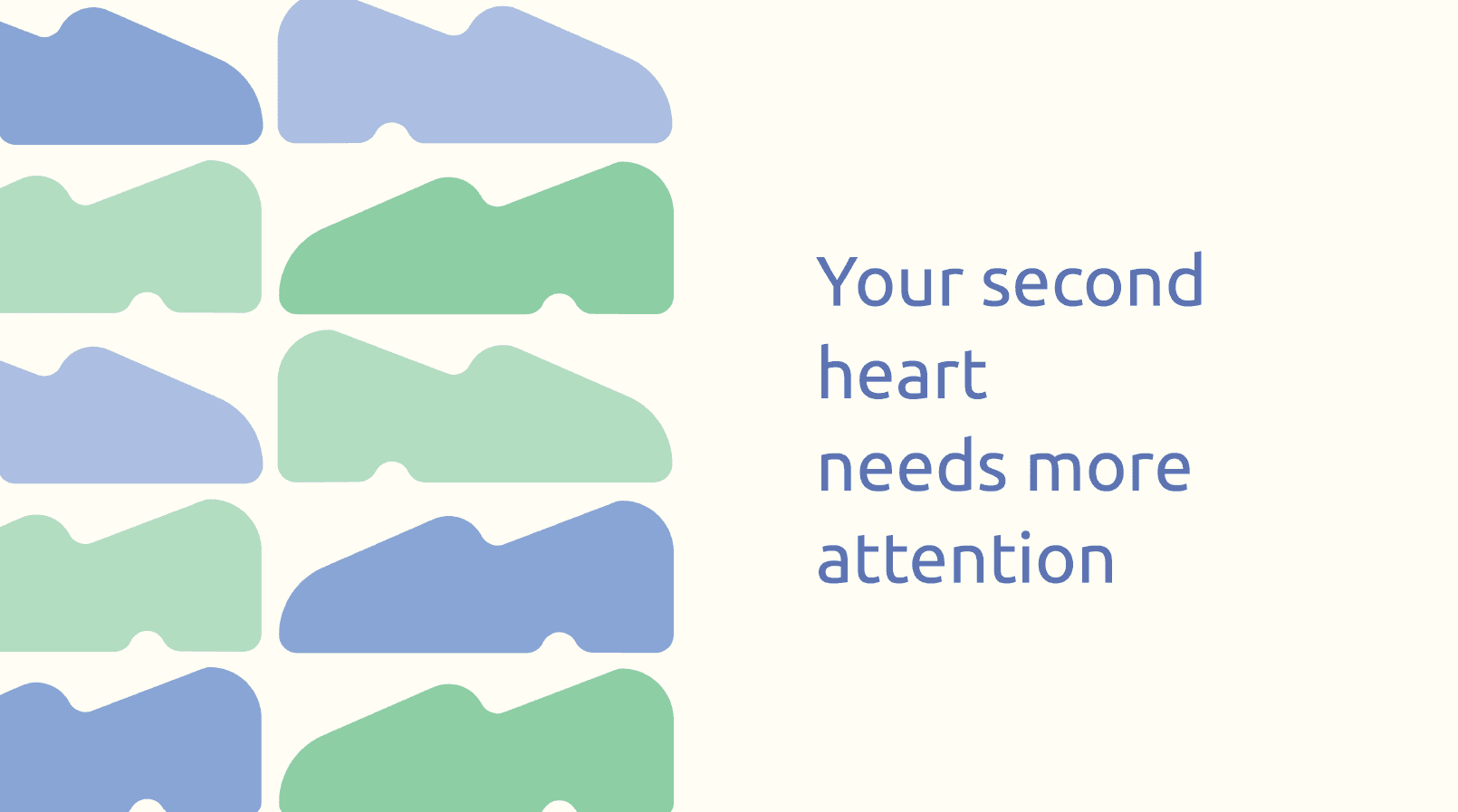
You built the identity around:
• Foot shapes
• Soft organic forms
• Breath / heart metaphor
• Calm, medical tone
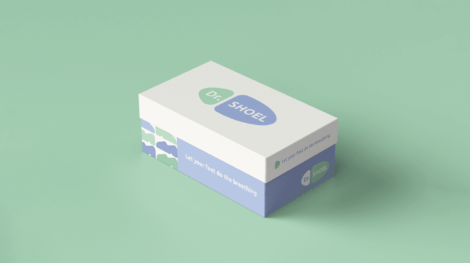
The tagline:
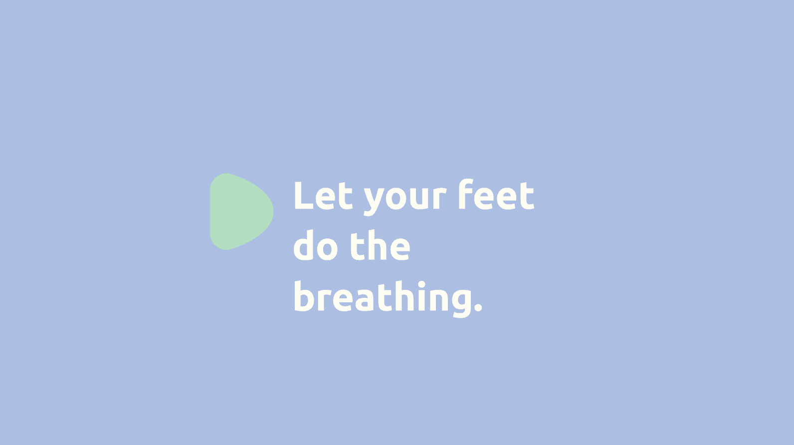
“Let your feet do the breathing.”
That’s clever.
It connects:
Feet → movement
Breathing → comfort / relief
Second heart → circulation
Strategically, this is actually strong thinking.
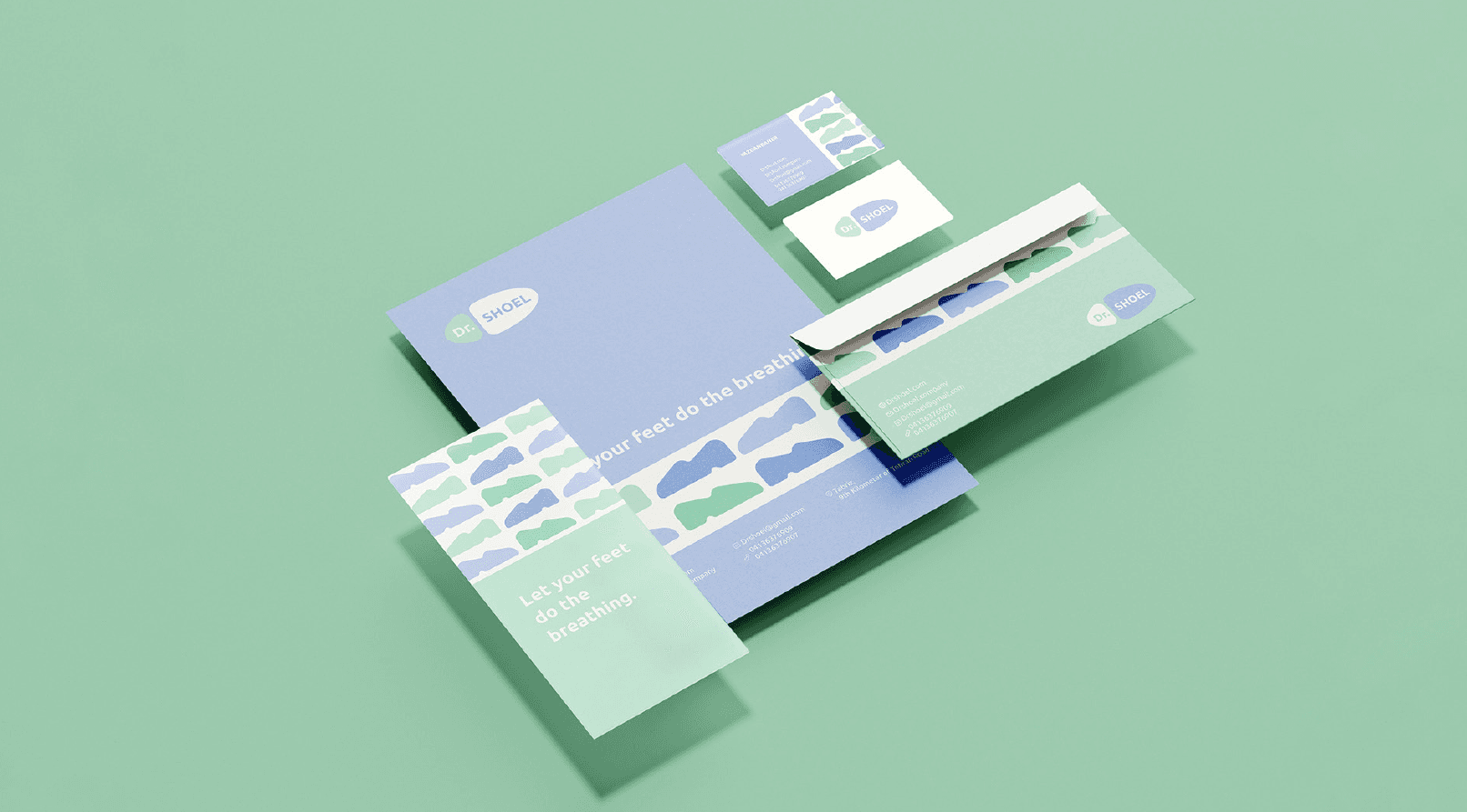
2. Visual Language
This is your softest project.
Rounded forms.
Pastel palette.
Lots of negative space.
It feels:
Medical but friendly
Orthopedic but modern
Health-focused but not sterile
That’s hard to balance — and you did it well.
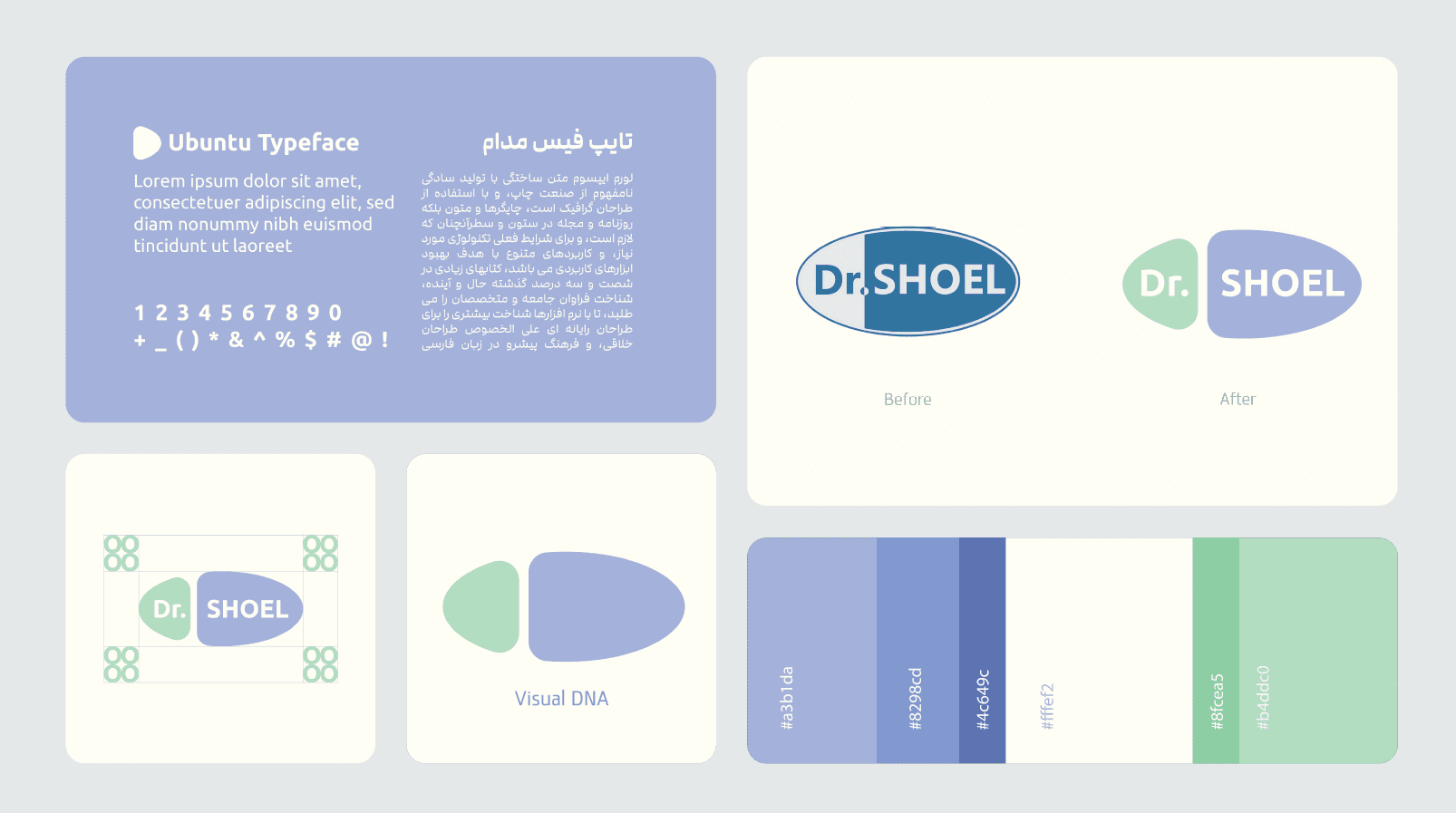
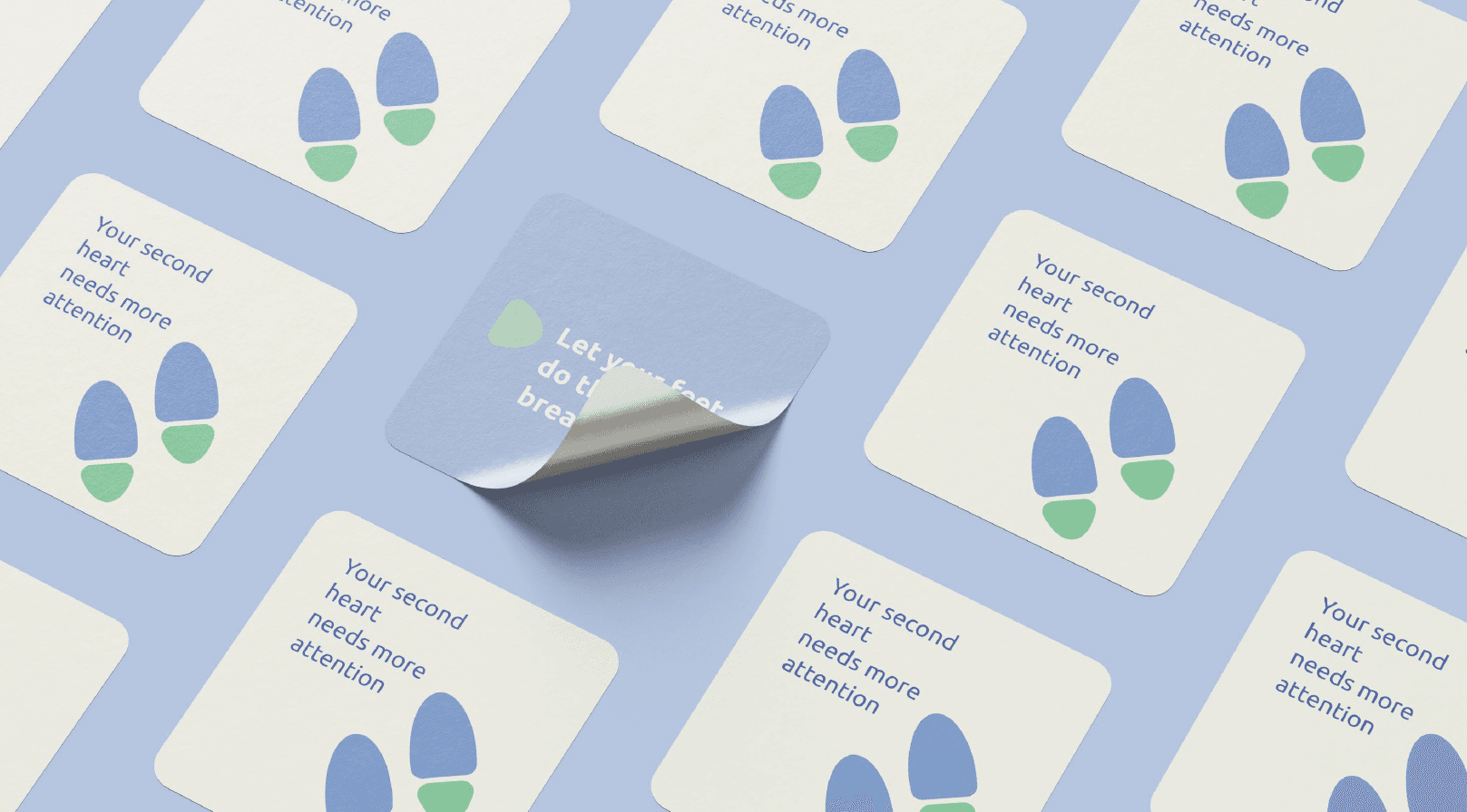
3. Logo Mark
The split organic pill shape works.
It communicates:
Left → doctor
Right → product
Two parts forming one whole
Simple.
Recognizable.
Scalable.
But:
It is not iconic.
It is not bold.
It is safe.
Which is not wrong —
but it won’t stand out dramatically in a competitive market.
4. Color Strategy
This is your most controlled palette.
Muted blue + soft green + warm neutral.
Psychologically:
Blue → trust
Green → health
Beige → warmth
Very appropriate for medical footwear.
Good strategic decision.
5. Typography
Ubuntu.
Functional.
Neutral.
Friendly.
But again — safe.
You tend to choose safe typography.
You rarely push typographic personality.
That’s a pattern across your portfolio.
6. System Thinking
This project shows something important:
You can design for different audiences.
BENTAYGA → luxury
EUDORA → culture
Dr. Shoel → healthcare
That range is impressive.
But again:
There’s no consistent signature yet.