Houmka Healthcare Branding & Digital Communication System Home Medical Services / Lab Testing at Home
website & web_app
Overview
Houmka is a home-based medical testing service designed to make laboratory diagnostics accessible, simple, and stress-free.
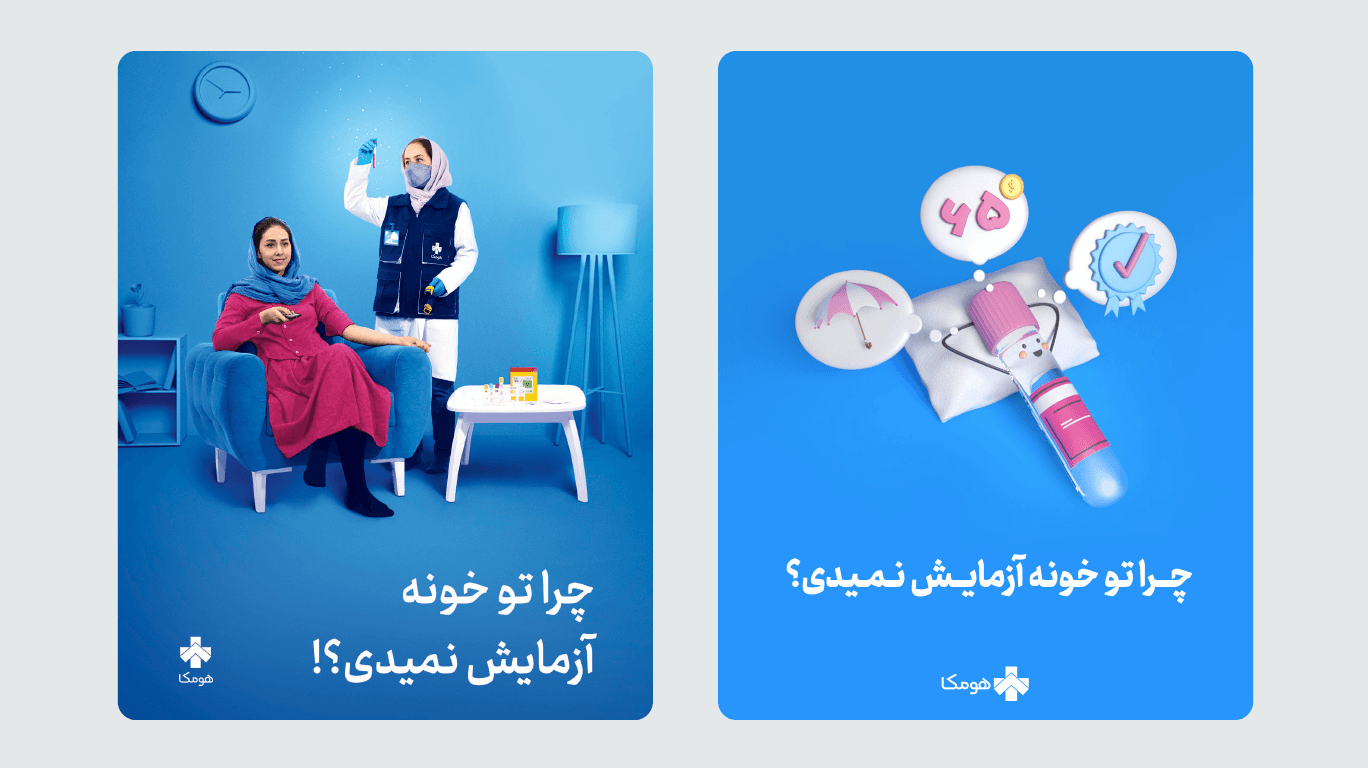
The core campaign question:
“Why don’t you test at home?”
The brand repositions medical testing from a clinical, inconvenient experience to a comfortable, reliable, at-home service.
Brand Strategy
Houmka positions itself as:
A trustworthy healthcare partner
A convenient home-testing provider
A friendly and approachable medical brand
The emotional shift is clear:
From hospital anxiety → to home comfort
From complexity → to simplicity
From uncertainty → to reassurance
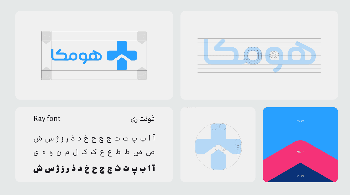
Logo Concept
The logo integrates two symbolic components:
Medical cross (+) — representing healthcare and reliability
Home roof shape — embedded inside the cross
This fusion visually communicates:
Healthcare delivered at home.
The Persian logotype was customized using Ray font, adjusted for better geometric balance and brand cohesion.
Color System
Primary colors:
Blue (#2A80FF family tones)
Pink accent (#F53278)
Dark navy accent
Blue represents:
Trust
Medical credibility
Stability
Pink is used strategically to add warmth and human softness, avoiding the cold clinical aesthetic typical in healthcare brands.
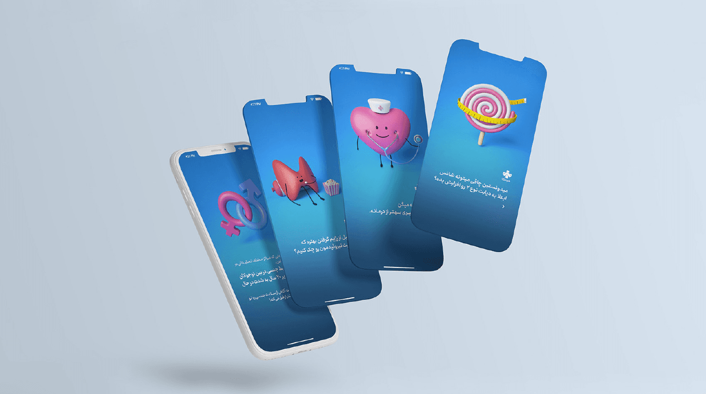
Illustration System
The 3D illustration language plays a central role.
Key characteristics:
Soft rounded forms
Friendly anthropomorphic medical objects
Simplified environments
Clean blue backgrounds
Examples include:
Smiling heart character
Liver illustration
Syringe and lab elements
Protective umbrella (insurance metaphor)
Measuring tape (health monitoring)
This approach reduces fear and increases approachability.
Campaign Concept
Main campaign line:
“Why don’t you test at home?”
The visuals emphasize:
Comfort of being at home
Professional medical staff visiting
Speed and convenience
Affordability
Certified and reliable service
The storytelling is built around removing common barriers:
Time, cost, discomfort, and uncertainty.
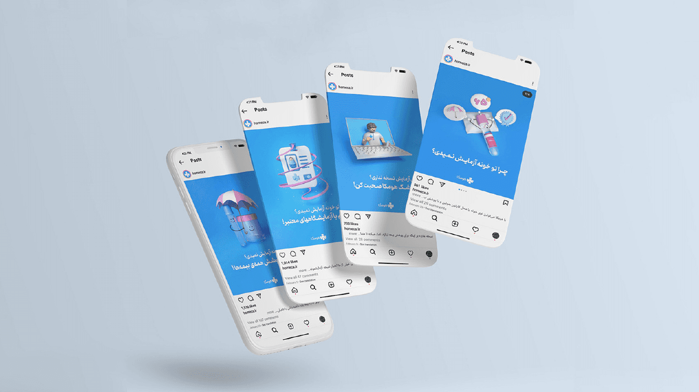
Social Media System
Instagram posts and stories follow a structured grid:
Blue gradient backgrounds
Central 3D object focus
Clear Persian typography
Strong visual hierarchy
Minimal clutter
The feed is consistent and scalable.
Story designs maintain:
Strong focal illustration
Minimal text
Clear CTA
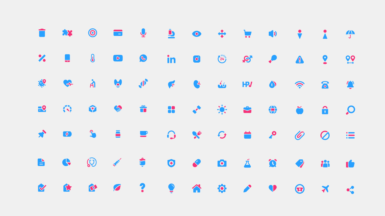
Icon System
A comprehensive medical and digital icon library was developed, including:
Health services
Insurance
Appointment booking
Payments
Diagnostics
Communication
The icon style is flat, dual-tone (blue + pink), and rounded — matching the brand personality.
This creates a scalable digital ecosystem for website and app UI.
Typography
Primary Persian typeface: Ray Font
Customized for:
Brand coherence
Geometric alignment
Consistent stroke weight
Typography balances:
Professionalism + Approachability
Brand Applications
The system extends across:
Social media campaigns
UI mockups
App visuals
Iconography library
Brand guideline pages
Logo construction grids
The identity is adaptable for digital-first healthcare platforms.
Psychological Positioning
Houmka reduces medical anxiety through:
Visual friendliness
Color warmth
Soft geometry
Human-centered storytelling
Instead of fear-based medical messaging, the brand communicates:
Comfort
Accessibility
Care
Strengths of the Project
Strong conceptual clarity (home + healthcare fusion)
Highly consistent visual system
Professional icon library
Friendly 3D illustration language
Clear digital-first execution
Scalable for app ecosystem