INBOUND Brand Identity & Event Visual System Marketing Conference Branding
website & web_app
Project Overview
Inbound is a business and marketing event designed around one core idea:
Businesses begin to scale.
The brand identity communicates growth, movement, structure, and strategic clarity — all central to inbound marketing philosophy.
Brand Concept
The concept is built on:
Attraction instead of interruption
Sustainable growth
Structured scaling
Modern data-driven marketing
The visual language translates these ideas into modular geometric forms that feel both dynamic and systemized.
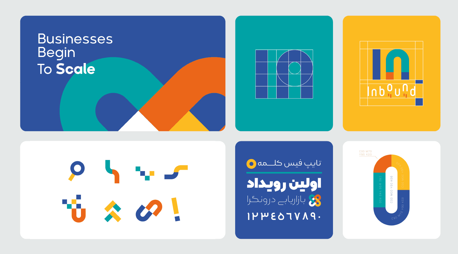
Logo Design
The core symbol is built around a modular “U / n” structure that visually suggests:
Connection
Flow
Magnetic attraction
Movement inward
The form is divided into color segments to symbolize:
Multi-channel integration
Process stages
Strategic layers
The wordmark is modern, rounded, and minimal — supporting clarity and accessibility.
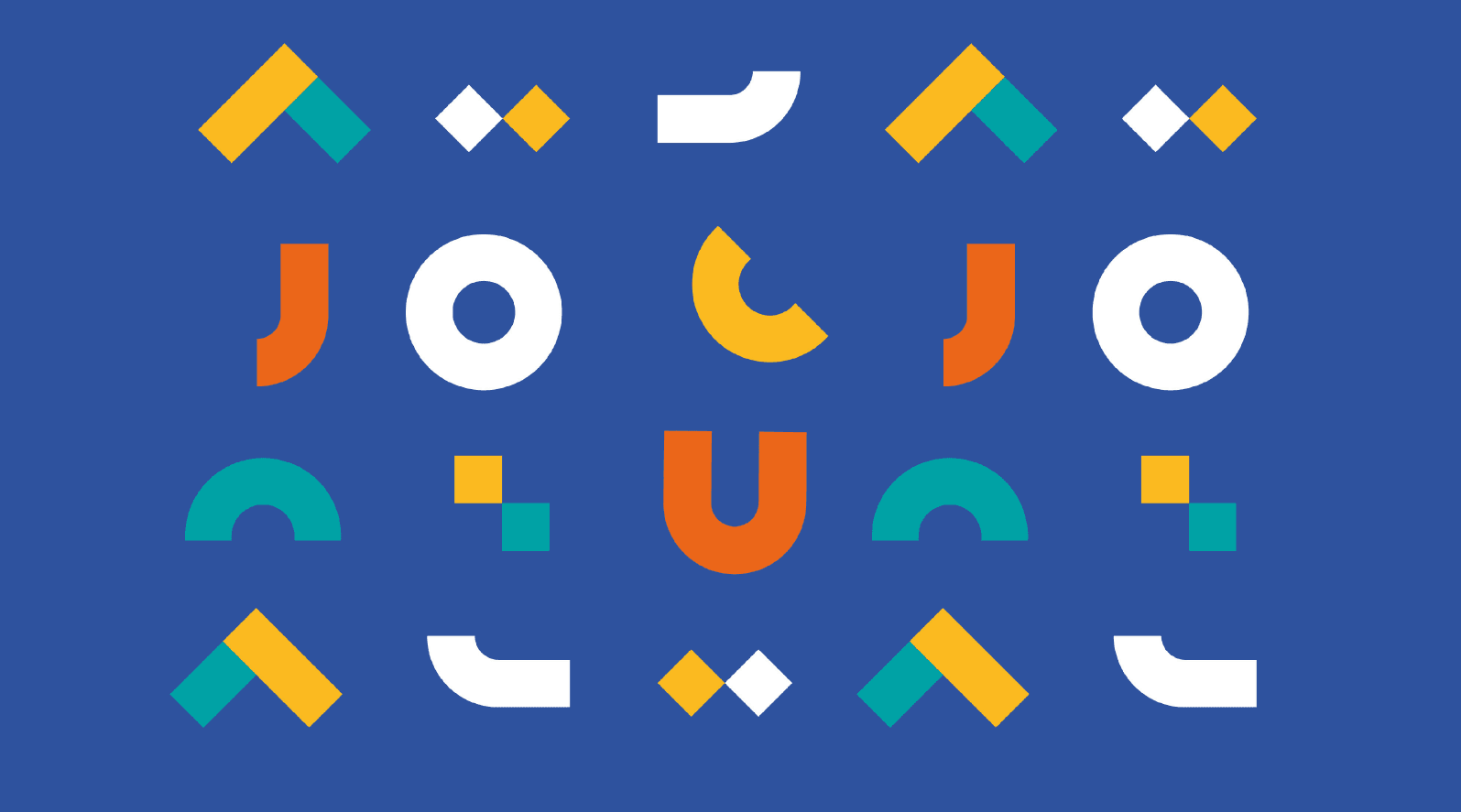
Visual System
The identity system is based on modular geometric components:
Arcs
Rounded blocks
Diamonds
Split-color shapes
Interlocking forms
These components can:
Create patterns
Form icons
Build large-scale compositions
Adapt across digital and print
This creates a flexible but controlled system.
Color Strategy
Primary Colors:
Deep Blue (trust, intelligence, authority)
Teal (innovation, growth, balance)
Yellow (energy, optimism)
Orange (action, movement)
White (clarity, space)
The contrast between blue and warm tones gives the brand both corporate credibility and dynamic energy.
Event Poster System
The poster uses a large vertical “U” form as the central structural element.
It acts as:
A visual anchor
A metaphor for inbound funnel
A framing device for information
Typography hierarchy is clean and highly legible.
The layout feels structured and modern.
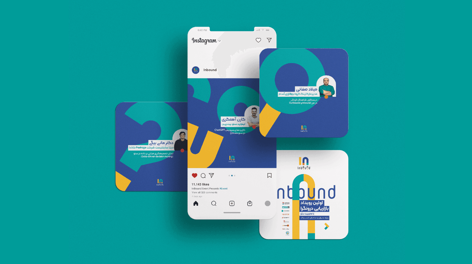
Social Media Applications
Instagram visuals emphasize:
Large modular shapes
Strong color blocking
Minimal text overlays
Speaker highlight cards
The system allows easy adaptation for:
Speaker announcements
Event countdowns
Educational content
Promotional campaigns
Consistency is maintained through shape language.
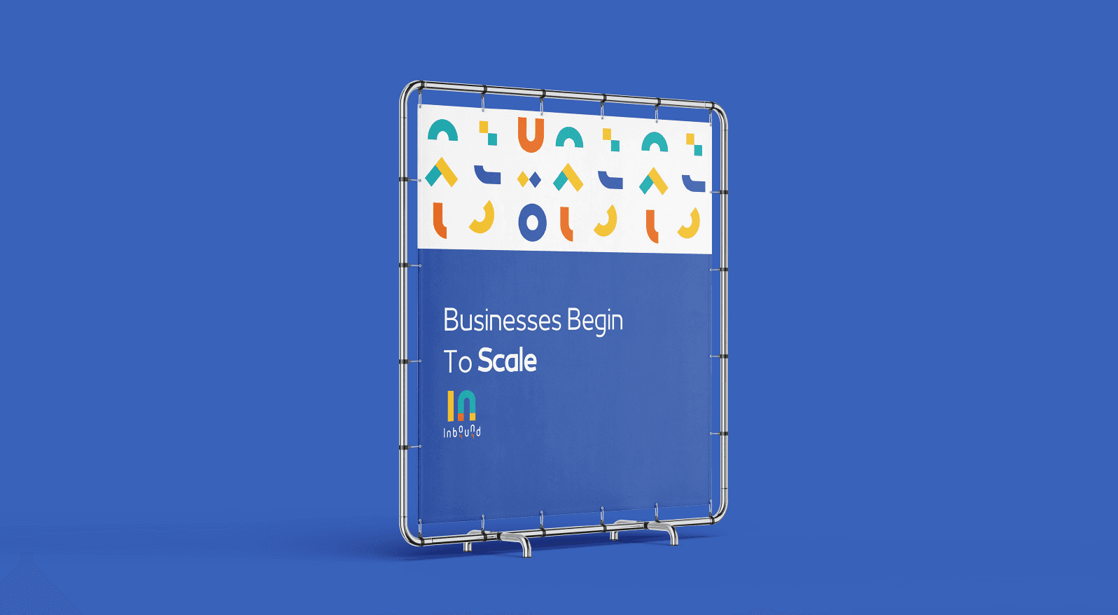
Outdoor & Environmental Branding
The street banner and event materials show:
High visibility from distance
Bold contrast
Simple messaging
Strong logo recognition
The pattern system adds vibrancy without overwhelming the composition.
Graphic Language
The repeating geometric motif creates:
Recognition
Rhythm
Cohesion
Visual storytelling
It feels modern, digital, and scalable — aligning with marketing and growth themes.
Emotional Positioning
Inbound feels:
Strategic
Professional
Forward-thinking
Data-driven
Optimistic
It positions itself between startup energy and corporate structure.
Strengths of the Project
Strong modular identity system
High scalability
Clear growth metaphor
Cohesive cross-platform consistency
Event-ready visual language
Clean typographic structure