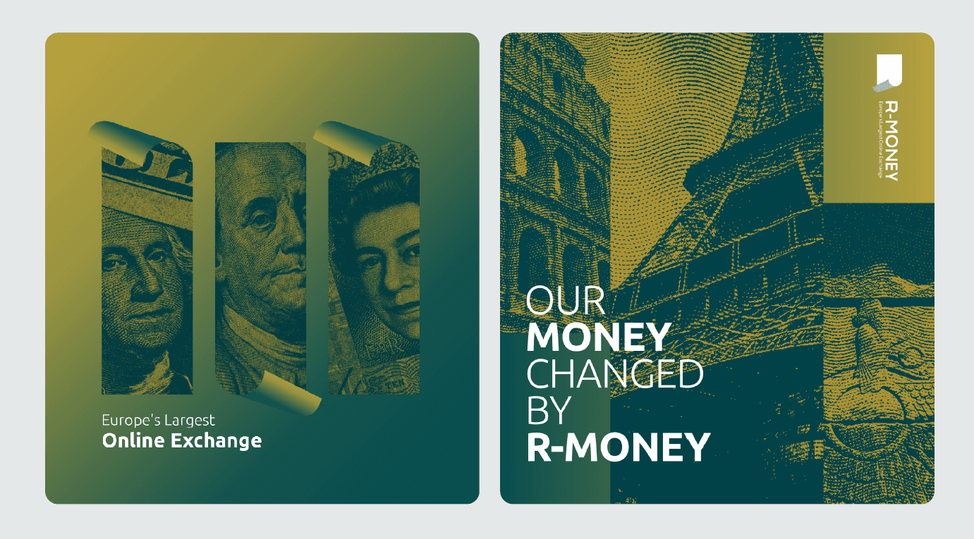
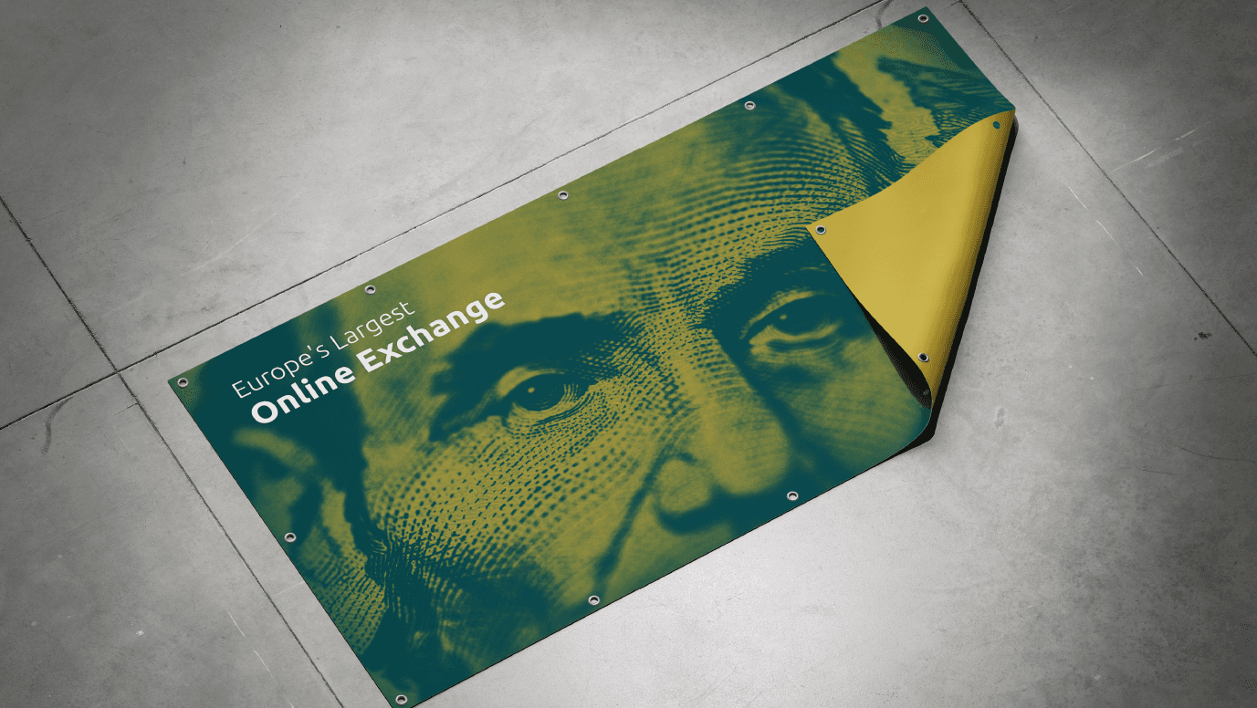
R-MONEY | Europe’s Largest Online Exchange
website & web_app

Overview
R-MONEY is a modern financial exchange brand positioned as:
“Europe’s Largest Online Exchange.”
The brand identity is designed to communicate:
Trust
Stability
Speed
Authority
Digital accessibility
The visual system combines strong geometric structure with currency-inspired graphic elements.
Brand Strategy
R-MONEY operates in the financial and currency exchange sector, targeting:
International students
Families abroad
Currency transfer users
European exchange customers
The identity needed to balance:
Corporate credibility
Modern digital presence
Emotional accessibility
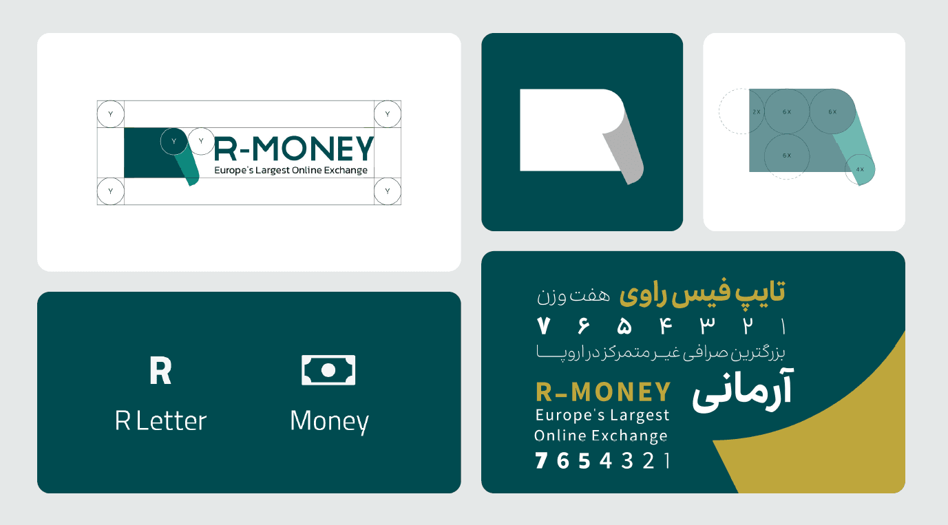
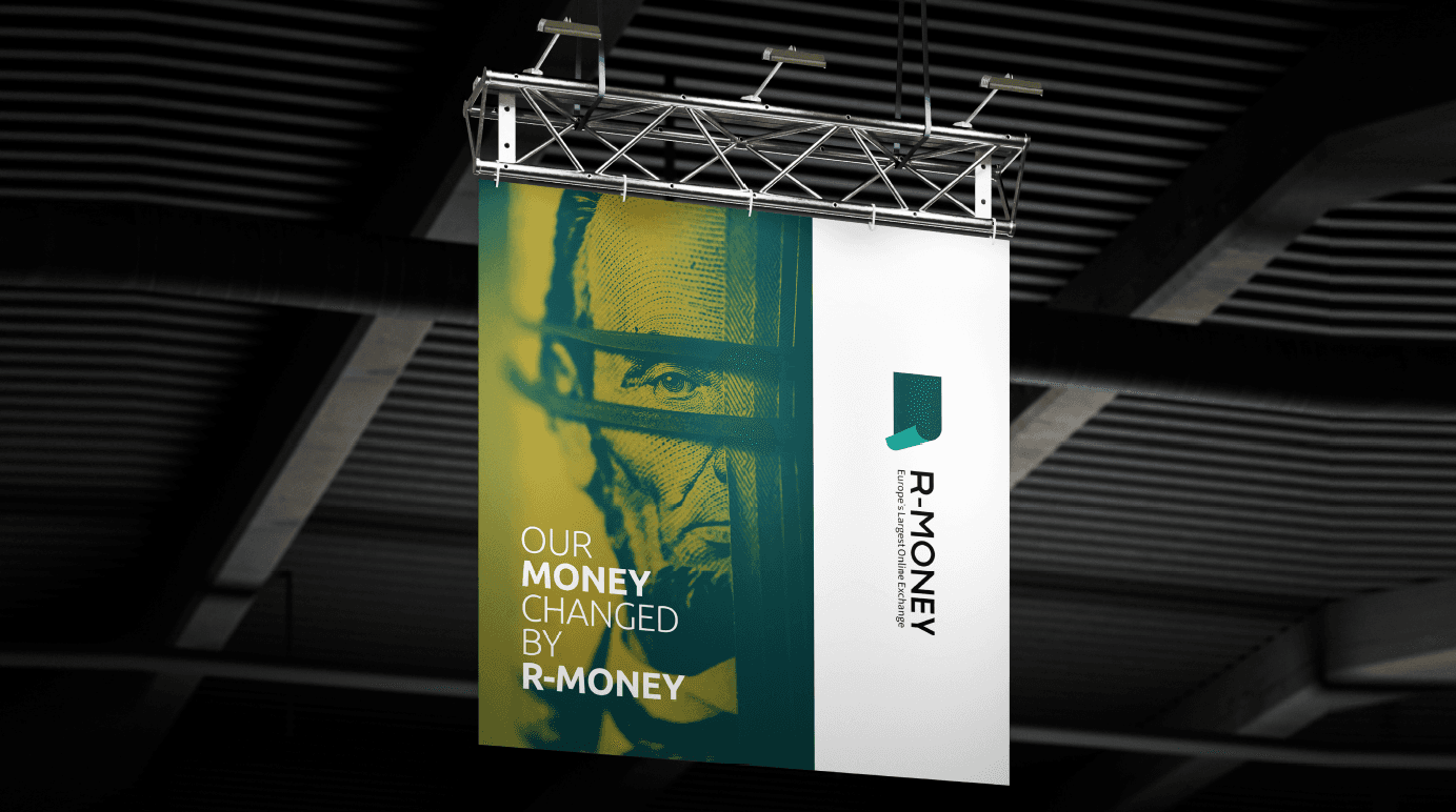
Logo Concept
The logo is built from two core ideas:
R Letter
Money Concept
The mark visually combines:
A structured geometric “R”
A folded-corner form suggesting movement and transaction
A solid block shape communicating reliability
The logo structure is grid-based and scalable.
Tagline
Europe’s Largest Online Exchange
This positioning reinforces:
Market authority
Geographic dominance
Digital-first operation
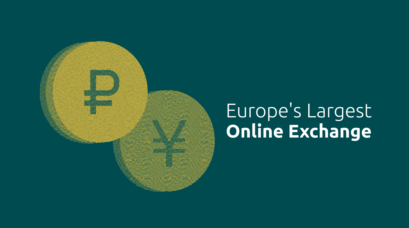
Color System
Primary Palette:
Deep Teal (Trust, financial stability, professionalism)
Gold Accent (Value, currency, premium positioning)
Neutral White & Light Gray (Clarity & balance)
The gold and teal contrast creates a premium financial tone without looking outdated.
Graphic Language
The identity uses:
Currency engraving-style textures
Coin-inspired circular forms
High-contrast typographic hierarchy
Clean negative space
Structured layout geometry
Visual elements often reference banknote engraving patterns, reinforcing financial credibility.
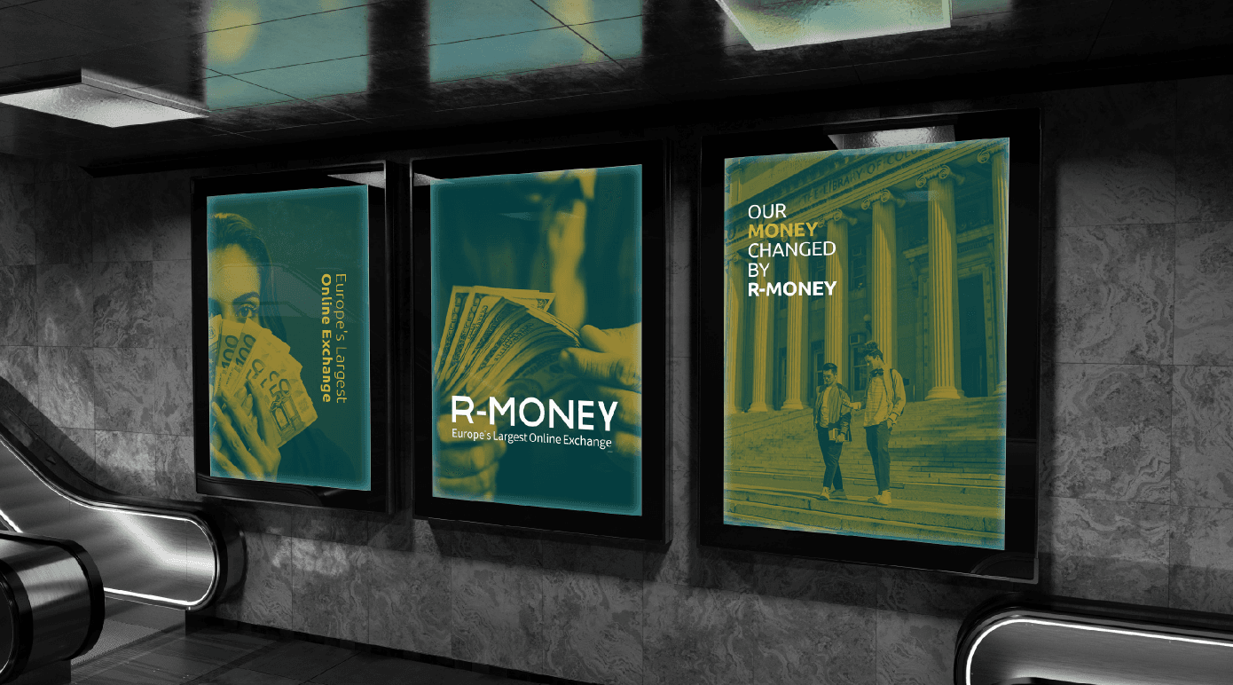
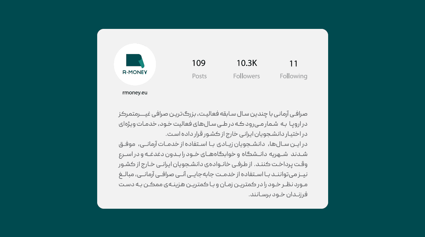
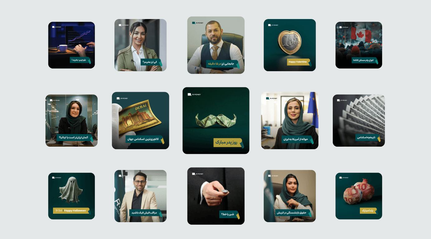
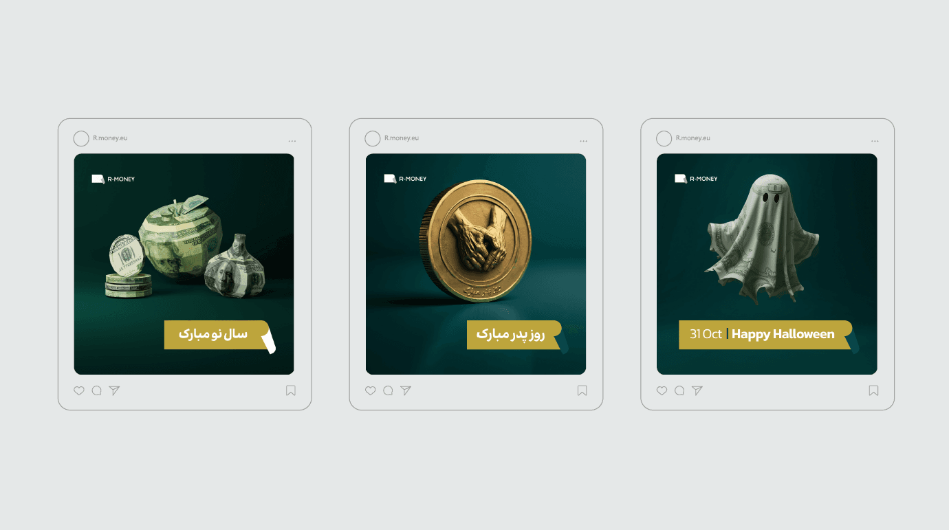
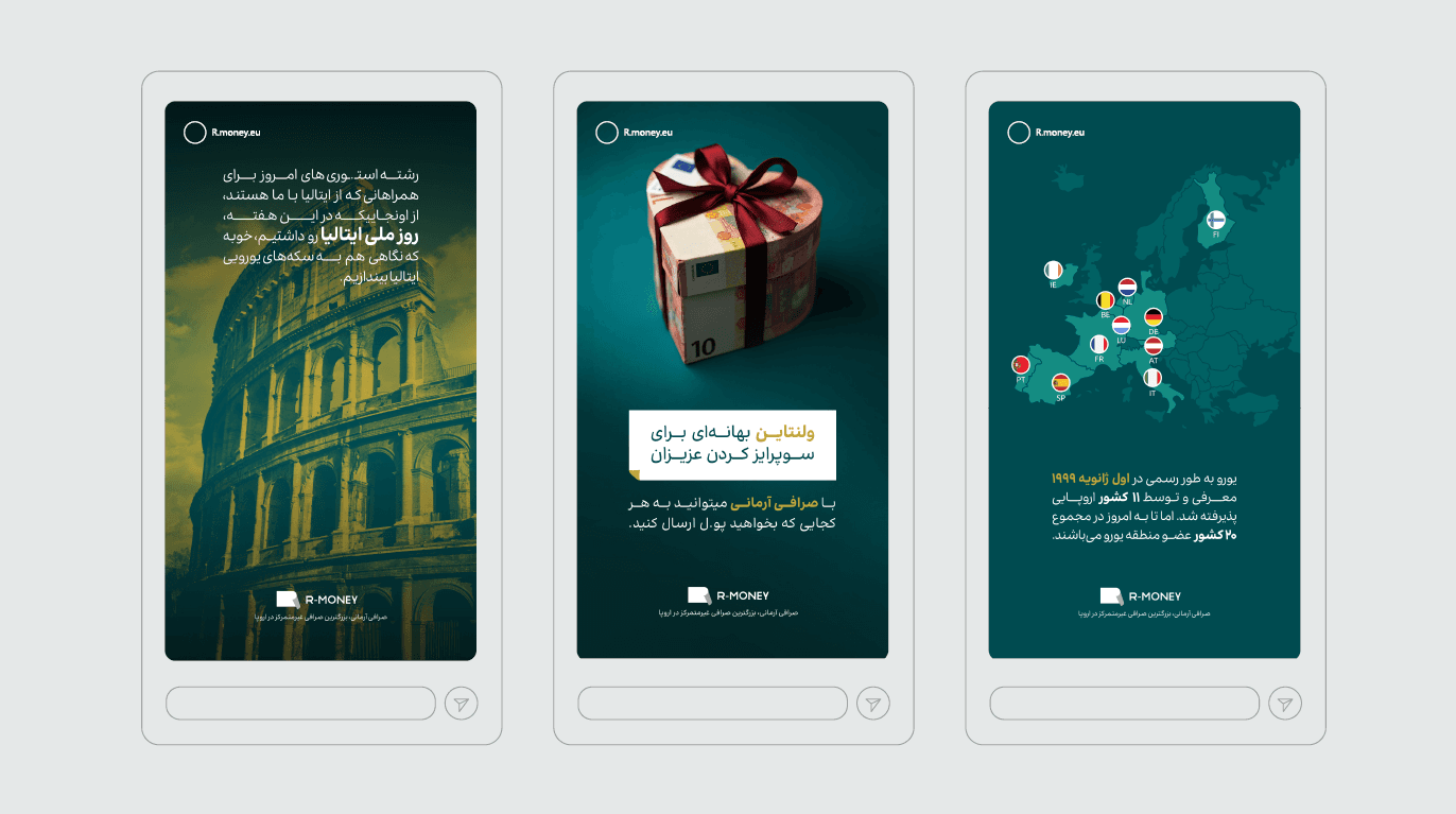
Social Media System
R-MONEY’s Instagram system includes:
Financial education posts
Seasonal campaign visuals
Cultural greeting posts (Nowruz, Halloween, etc.)
Currency-themed 3D compositions
Human-centered communication (team & experts)
The feed maintains:
Consistent dark teal background
Gold CTA labels
Clean typography alignment
Strong logo visibility
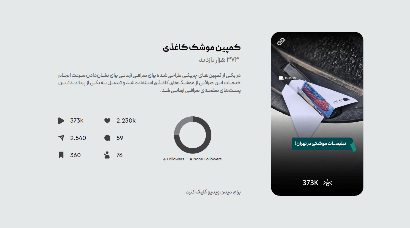
Campaign Highlight
Paper Rocket Campaign
A creative guerrilla-style campaign where:
Currency-designed paper rockets were placed on cars
Video reached 373K views
High engagement from non-followers
This campaign increased brand awareness significantly.
Stationery & Print System
The brand includes:
Business cards
Brochures
ID cards
Branded envelopes
Exchange booklets
All materials follow:
Structured typography
Controlled color ratio
Clear hierarchy
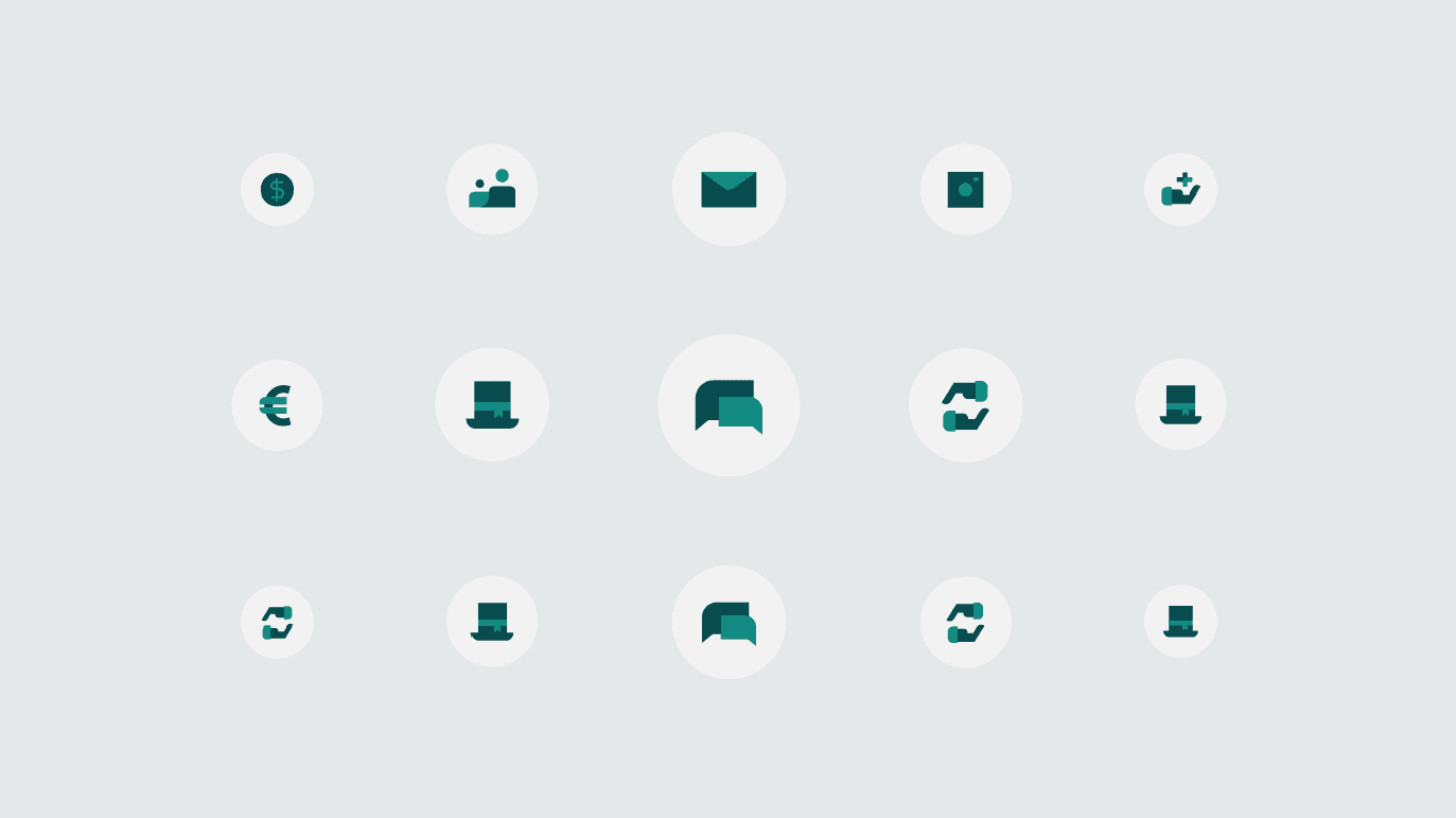
Icon System
Custom icon set designed for:
Transfers
Messaging
Customer service
Currency
Notifications
Icons are minimal, circular-based, and aligned with brand stroke weight.